Entro
Entro is an environmental graphic design firm based in New York City. Where I worked on client-facing projects at different phase of development and an internship project throughout the semester
Client-facing projects
Changi AirportSEPTA MetroMETRA Metropolitan RailNYU Langone HealthEntro Intern Project
Research, audit, and develop a design scheme for a wayfinding / identification signage family for a NYC-area exterior destination. Selection must provide opportunities for wayfinding intervention and should include some historical or cultural significance.
Site: Chelsea FleaInitial Research
The Flea has been established for more than 40 years in the community. Originally founded by Alan Boss the Chelsea Flea Market in 1976 and shuttered in 2019, it relaunched in 2020 under Brooklyn Flea’s management.
Currently, this temporary weekend flea market lacks strong branding and event presence. For my project, I aim to revamp its identity and enhance its overall experience.
Site Audit
This spaced is used as parking lot during the week and during the weekend it doubles as a flea market.
Site Audit
This spaced is used as parking lot during the week and during the weekend it doubles as a flea market.


weeks
weekends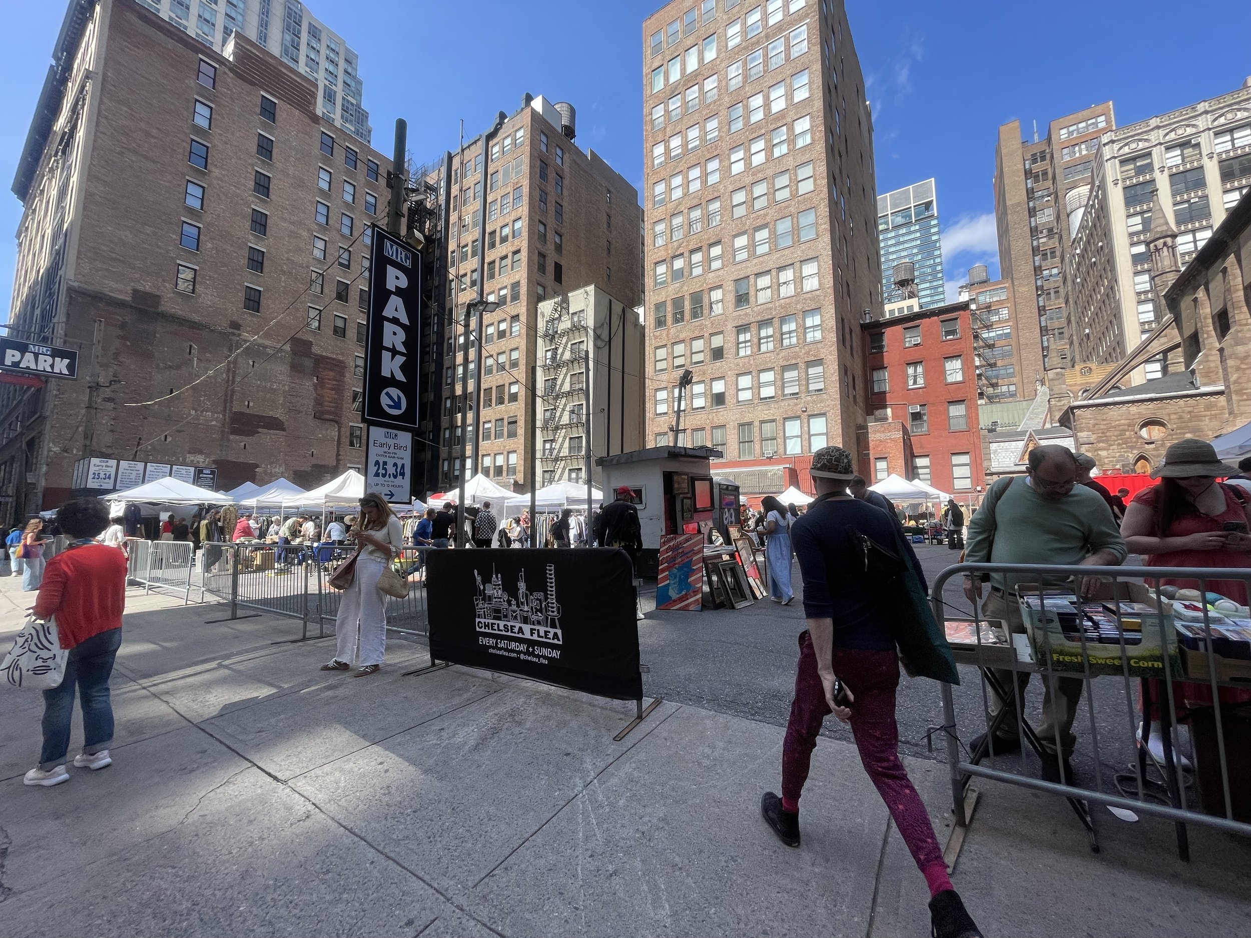

Images from Chelsea Flea socials 


Schematic Design
Developed mood boards for two different design concepts. One that connects with the architecture around Chelsea and the other with the historical context of a flea. I decided to do a blend of both because believe it had major historical and cultural ties to the flea
Concept 1- Bazzars
Concept 2- Chelsea Architecture 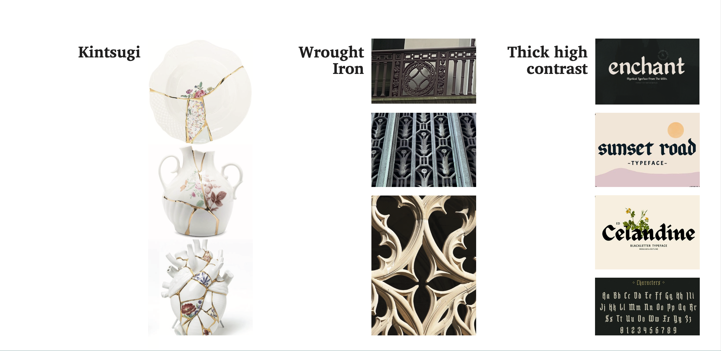
Design Development
Researching fleas and bazaars revealed vibrant color palettes, making their implementation essential. The three base colors serve distinct roles
Orange provides an energetic, directional element to guide traffic, incorporating Kintsugi patterns to highlight the beauty of repaired or repurposed items.
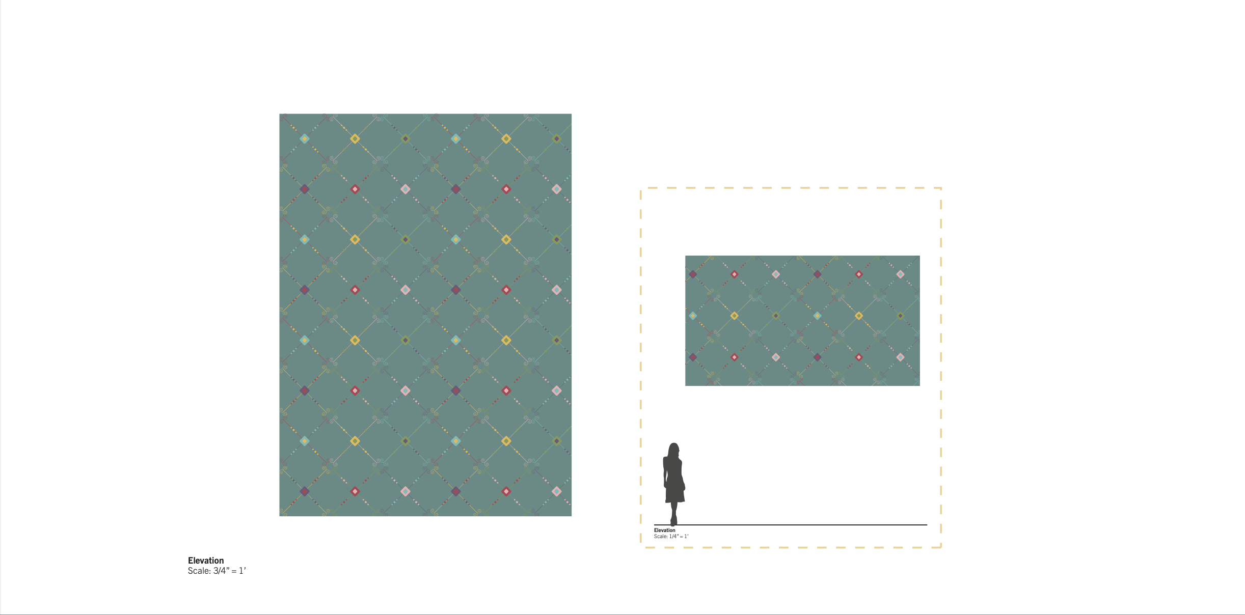
Teal is used for exterior signage, harmonizing with Chelsea’s surroundings and wrought iron patterns.
Gold reinforces the Kintsugi narrative of the flea market.
Lastly, the typeface is inspired by medieval scripts, enhancing the market's character.


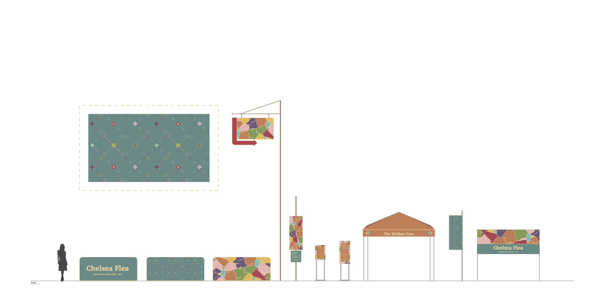
Signage Elevations & Renders
Entry Moment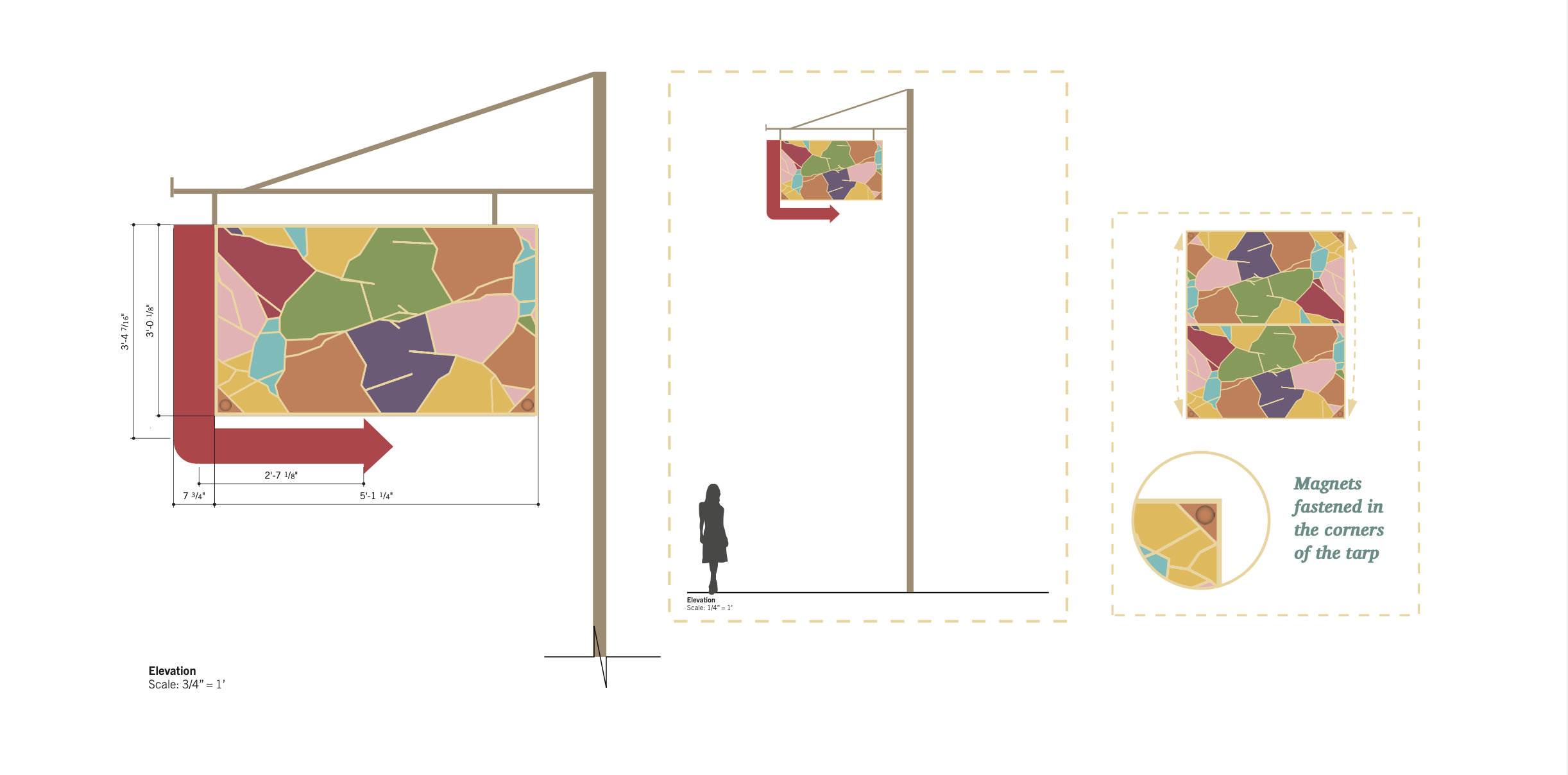


Directionals & Market

Back Entry Moment

Sign Family